The Market Area Map identifies market area changes for each licensed healthcare facility from 2013 and 2018. This map identifies market share – where patients from a specific area go to for hospital inpatient, emergency department, and/or ambulatory surgery treatment.† Each facility’s market zip code is split into three groups: (1) Market Lost, (2) Market Maintained and (3) Market Gained.
Data Visualization: Healthcare Facility Market Area Map 2013 and 2018
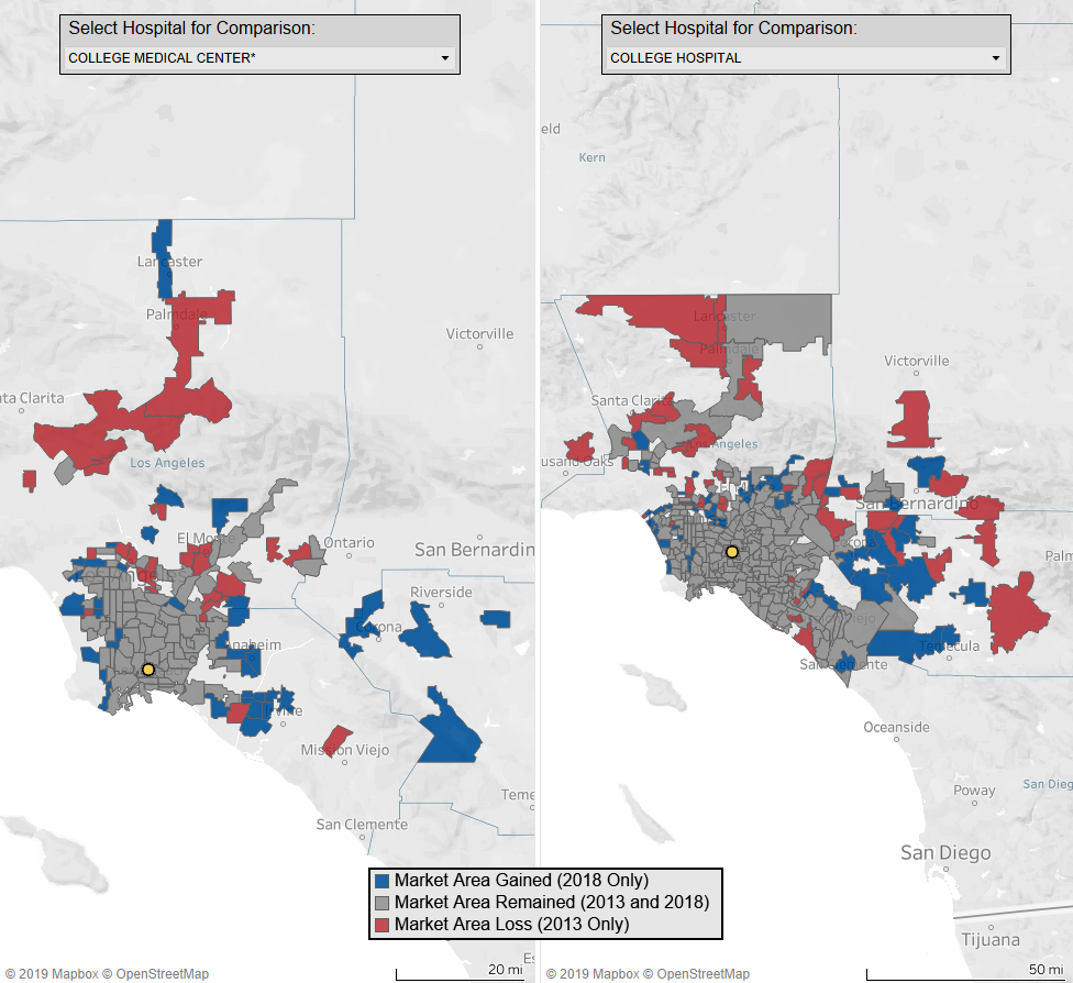
Market Share - 2013 and 2018